|
It's more of an "i before e" than a "never do this" rule...  One of my instructional design students recently raised a good question about the use of color to emphasize text in digital documents (one that warrants a bit of a "mea culpa" on my part!). In the first weeks of the term, I advised students to avoid highlighting text or using colored fonts for emphasis. Then, in a recent response to another student's discussion forum questions, I highlighted her questions to set them apart from my responses. The recent question was along the lines of "you told us never to highlight text because it is a digital accessibility violation, but you just highlighted text in your post... can you clarify?" Is it Ever Okay to Use Color for Emphasis?So... my "mea culpa." My initial advice came across as a "hard and fast" rule -- NEVER use color for emphasis. The truth is, it is a bit more like the "i before e" rule of English spelling than an absolute. There are plenty of exceptions to the "i before e" rule in the English language. And, there are plenty of nuances to the "rules" around using color for emphasis of text in instructional design. In my early course advice, I didn't get into these nuances because we'll be exploring digital accessibility basics for instructional design in more detail later in the course (as students are building ID pilot projects). The original student had highlighted some key points in a discussion post for emphasis, and another student had configured all of their discussion posts to use a purple font. So, I brought up the topic of the use of color for emphasis a bit early, to get my students thinking about how to avoid creating unnecessary barriers for their reading audiences (kind of like how primary school teachers emphasize the "i before e" rule in the early grades, and let students learn the exceptions and nuances of English spelling later on). The truth is, you CAN use colored text or highlighted text for emphasis. BUT, it ONLY works for "sight" readers who have no visual acuity issues. Such techniques will cause issues if:
So... you CAN use color for emphasis. BUT, you must carefully consider the potential unintended consequences for your audience! The best strategy is to avoid using colored text or highlighted text unless absolutely necessary. That will avoid all of the issues noted above. Another strategy is to include some additional form of emphasis to grab the attention of "audio" readers, such as adding a graphical icon with appropriate ALT text like the following: It is important to use strategies that will indicate emphasis for anyone using a screen reader application. In the example above, the "alert" icon creates additional emphasis for "sighted" readers. It also contains the ALT text "This is an important point!," which will be read aloud to "audio" readers who are using screen reader applications. Finally, you should always "test" your product before sharing it. You can use a color contrast analyzer tool like the free Colour Contrast Analyzer available from TPGI (2024). When testing color contrast ratios (the perceptive differences between the foreground (text) and background (page or screen) colors), be sure to also test the ratios when displaying the content in grey scale, and when displaying the content on a dark mode screen. Here's how that would look using a sample of the text like what I shared (using yellow highlighted text, and some text with a purple font) via our course discussion forum: 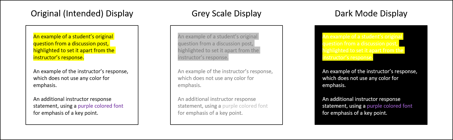 Examples of a discussion post with some yellow highlighted text and some purple text, displayed in light mode, grey scale, and dark mode. Testing Color ContrastLet's take a look at the results of color contrast tests on each text display version to see where we run into potential accessibility issues. Default (Black on White) Text: 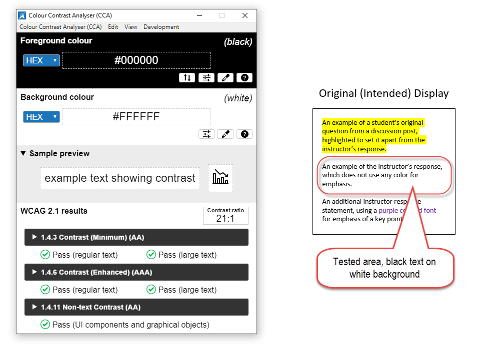 Black text on a white background produces the best color contrast ratio. Testing the Highlighted Text: 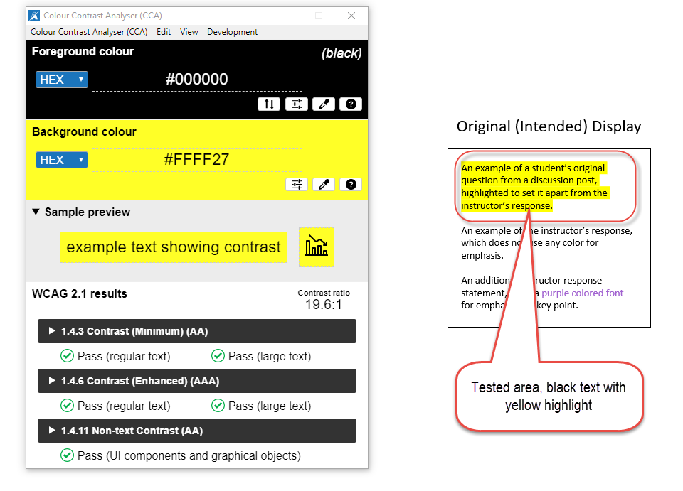 The yellow highlighted text is still passable when viewed in "light mode." As you can see, the yellow highlighted text that I used in my discussion forum post is still readable, and passes all levels of WCAG standards for digital accessibility (World Wide Web Consortium, 2023). But, how about when that text is viewed in grey scale or on a "dark mode" screen? 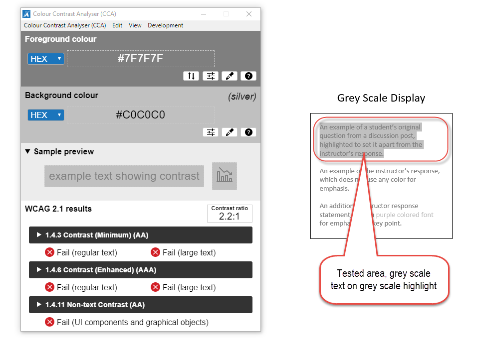 The highlighted text is barely readable in grey scale, and does not pass Digital Accessibility standards. 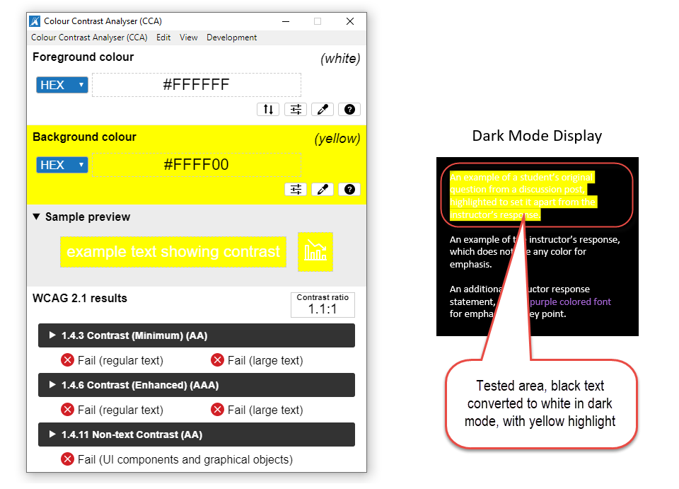 The yellow highlight completely "washes out" the default format text, which converts to white on a "dark mode" screen. Testing the Purple Text: Now, let's take a look at the text formatted with a purple font. 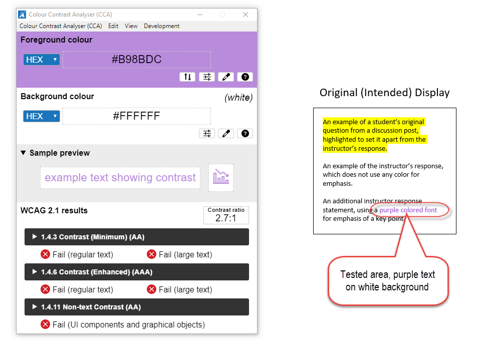 The purple font's contrast ratio is too low against the white background. 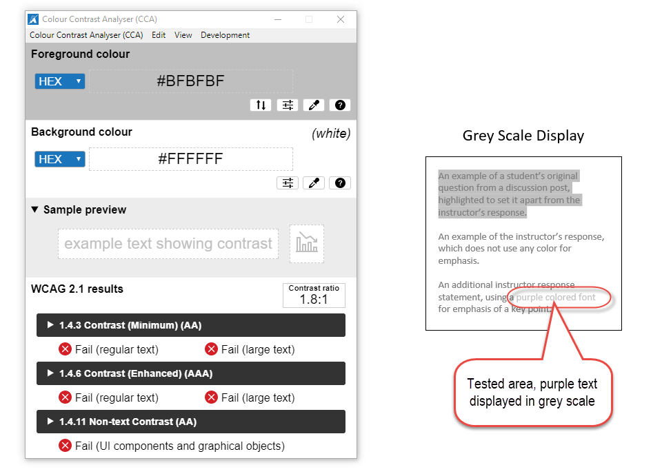 The purple text is barely readable when displayed in grey scale. 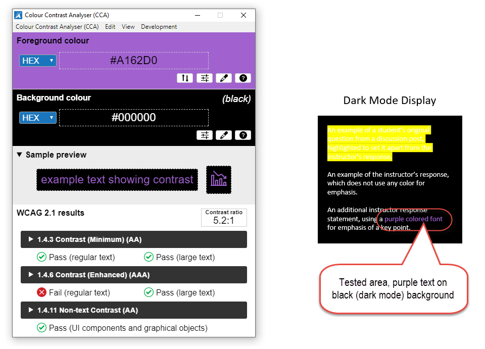 The purple font is okay for larger text when displayed in "dark mode," but may cause issues for smaller text. The color contrast test results show that using a purple font can be problematic for your readers in just about any screen display mode. Accommodating Everyone When Emphasizing TextSometimes it is necessary to use color to emphasize things when creating digital teaching and learning resources (or any digital text resources). For instance, differentiating between items based on their color may be a functional technical requirement (such as with colored buttons), or one of your required content learning outcomes (such as differently colored safety labels). In those cases, you can use the following strategies:
The key is to ensure that any emphasis you intend to create by using color is not lost for any readers who cannot actually perceive that color, or who will have difficulty viewing the text because of the color choice! Additional Resources
ReferencesOpenDyslexis (n.d.). OpenDyslexic: A typeface for Dyslexia. https://opendyslexic.org/
Power, R. (2020, February 13). Helping Everyone Access Your Online Teaching Resources. [Web log post]. Power Learning Solutions. https://www.powerlearningsolutions.com/blog/helping-everyone-access-your-online-learning-resources Power, R. (2023, April 6). A Picture Isn't Always Worth a Thousand Words... [Web log post]. Power Learning Solutions. https://www.powerlearningsolutions.com/blog/a-picture-isnt-always-worth-a-thousand-words Power, R. (2023). Chapter 17. Accessibility in Online Learning. Everyday Instructional Design: A Practical Resource for Educators and Instructional Designers. Power Learning Solutions. https://pressbooks.pub/everydayid/chapter/accessibility-in-online-learning/ TPGI (2024). Colour Contrast Analyzer (CCA). https://www.tpgi.com/color-contrast-checker/ World Wide Web Consortium (2023). Web Content Accessibility Guidelines (WCAG) 2.2. https://www.w3.org/TR/WCAG22/
0 Comments
 Sometimes we share videos with our students that are not narrated, and that contain just on-screen text. While viewers can technically read the text embedded in the video, this method does not truly meet Digital Accessibility requirements. That's because the use of embedded text in a video is the same as embedding text within an image in a document. It is not machine-readable, and thus it excludes audience members who may need to use a screen reader application for any reason (they may be visually-impaired, have low language reading ability, have a reading-related learning disability such as Dyslexia, or they may be a non-native language speaker who needs to translate your text for better comprehension). The two best ways to help all potential viewers get the most out of your non-narrated video content are to:
Creating Captions In YouTubeYouTube Creators (2021) has an excellent overview of how to add or edit captions either when you are uploading your video, or after your video has already been published. Remember, for a video with no narration (just text on screen), you will need to transcribe that text into the captions editor (either manually, or copy-paste the "slide" text from your video, and insert it to align with the timings when it appears on screen. Creating Your Own Captions FileAnother option for creating subtitles or captions for a non-narrated video is to use an external video editing application, like Screencast-O-Matic (2019). This option works well if you have a copy of the video file (MP4 or other format) on your computer, but is less useful if you use a tool like PowToon (2022) to create your video and export it directly to YouTube (because you cannot download the video file unless you have a pro-level subscription). While the following webinar demonstration video (Power, 2021, April 9) features the creation of captions for a narrated video using Screencast-O-Matic, the steps for creating, editing, and uploading your captions file to YouTube would be the same for a text-only video. Adding a Transcript FileIn addition to making sure your text-only video has Closed Captions enabled, I also strongly recommend adding a transcript file for your visually-impaired users. A transcript file can be opened or downloaded. Your audience members can then use any screen reader application (such as JAWS (Freedom Scientific, n.d.), NVDA (NV Access, 2023), or Google Read and Write (Texthelp, 2023)) to read the on-screen video text out load to them. The following video shows how I uploaded a transcript file to Google Drive, and then added a link to that transcript to the video description for my instructor welcome video in YouTube. Remember to make sure your transcript file meets basic document accessibility requirements before sharing it! For more on that topic, refer to my blog post Helping Everyone Access Your Online Learning Resources (Power, 2020). ReferencesFreedom Scientific. (n.d.). JAWS. [computer software]. https://www.freedomscientific.com/
NV Access (2023). About NVDA. [computer software]. https://www.nvaccess.org/about-nvda/ Power, R. (2019, November 9). Hi There! Meet Rob Power. [video]. https://youtu.be/ff-6GtdX9xM Power, R. (2020, February 13). Helping Everyone Access Your Online Learning Resources. [Web log post]. Power Learning Solutions. https://www.powerlearningsolutions.com/blog/helping-everyone-access-your-online-learning-resources Power, R. (2021, April 9). Creating Your Own Video Captions (Webinar Demonstration). [video]. https://youtu.be/4ghNMjCDOfg Power, R. (2023, May 1). Adding Transcripts to YouTube Videos. [video]. https://youtu.be/q5z_ZHCVFjg PowToon (2022). https://www.powtoon.com/ Screencast-O-Matic (2019). Video Creation for Everyone. [Web page]. https://screencast-o-matic.com/ Texthelp (2023). Read&Write for Google Chrome. [computer software]. https://www.texthelp.com/products/read-and-write-education/for-google-chrome/ YouTube Creators (2021, May 5). How to Add Captions While Uploading & Editing Your Videos. [video]. https://youtu.be/rB9ql0L0cU Sometimes Using Graphics Does More Harm Than Good
Does the Graphic Contain Text?There are lots of cases where the graphics we use contain text. Sometimes it is unavoidable. The questions you should be asking in this case are:
The following graphic illustrates a common example of graphics that I see in my email inbox where actual text should be used instead of the image:  There is nothing in this graphic that could not be put in regular text format, and a screen reader cannot "see" the text in the image to read it out to you. Sure, you could repeat the text within the ALT tag for the image, so that a screen reader will read it out... but what's the point? The graphic does not actually clarify or add anything to the message, and you are wasting time creating the graphic and typing the text into the ALT tag when you could simply type it right onto the page! Additionally, text within your image will NOT reflow and resize based on the reader's screen size and orientation, which could also render that text unreadable to your entire audience. You are also preventing anyone who uses an Accessibility plugin from modifying the font, color, or contrast of the text to make it more readable in their specific context. And, besides the message potentially being lost for anyone using a screen reader (if they do engage with the content at all), there is the potential that your intended audience may also view the message as SPAM, and thus ignore it! Here is a better example of a graphic that could be used to accompany the same message. In this case, you can see that the image is being used to draw visual readers' attention to some key points. The accompanying ALT text tells a screen reader user why the image is being used. And the main points of the message are included in regular text format in the body of the page.  When The Message Gets Washed AwayIf you are going to use a graphic as part of your message or content page, make sure you test that image in "dark mode." Most of the time, we are not working in dark mode when we create graphics. If our graphics have transparent backgrounds, they will display differently for any reader who has adjusted the color scheme of their screen. Parts of the graphic may end up getting "washed out" by a different color screen background, rendering them unreadable. Here is an example of an email message that contains a graphic with a transparent background, as viewed in dark mode on my mobile device. The message was unreadable until I got to my desktop computer!  The quick fix to this is to remove the transparent background before publishing the graphic, and choose a background color that has a sufficient color contrast ratio with the foreground (text). TL:DR
I frequently received questions about using tables to organize content on web pages or course content pages in an LMS. I also frequently see novice instructional design students do this in order to make content line up for aesthetic purposes. The problem is, if you are not well-versed in HTML coding, and using tools like Bootstrap UI to create engaging, interactive, responsive page elements, then using simple "tricks" like aligning contents with tables, manually formatting text for emphasis, or manually inserting lines on your pages to create visual divisions between content can actually create more problems then they solve! Insprired by a recent flurry of questions from my ID students, I put together this video to demonstrate what problems you create when you use tables to organize content (among other issues). The key recommendations to optimize course page layout, minimize cognitive overload, and minimize Digital Accessibility issues are:
ReferencesPower, R. (2023, February 20). UX and Accessible Course Pages. [video]. https://youtu.be/QEvJ6r1ylDo
 There’s an old adage that “a picture is worth a thousand words.” Well, that isn’t true is you can’t see the picture! Which brings me to the inspiration for this blog post, and for a series of videos that I just put together. I am working with a client that has a number of PDF versions of mock WHMIS information sheets (Canadian Council for Occupational Health and Safety, n.d.) that they want to make available as downloads to accompany a new series of workplace safety online training modules. The problem is, those PDFs are all image-only files. They reminded me of the photocopies and scans of course readings, like the one pictured below, that I used to find on reserve in the university library, or uploaded into online courses that I was a student in. 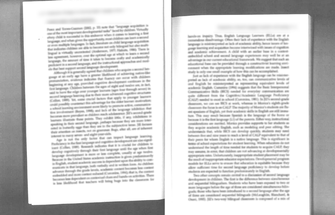 The problem with these image-only readings is that they are not machine-readable. They contain no text that a screen reader application could read aloud to students who have visual impairments. Thus, they are only as good as their ALT text – and you certainly cannot (or at least you should not) recreate all of the text embedded in the images in their ALT tags! If you did, you are probably only going to make things worse from a Digital Accessibility standpoint:
Luckily, there are ways to determine if a PDF you want to share with your students is machine-readable (and, at least somewhat accessible). In the following video, I demonstrate how to do this using both Adobe Acrobat Reader (2023b) (free!) and Acrobat Pro (2023a) (paid).
So, how do you create your own PDFs that you know will be (at least somewhat) accessible, and okay to share with your students? In the following video, I demonstrate how to use Microsoft (2022) Word to do just that be preformatting the required heading, paragraph, and image (ALT) tags before you export it to PDF.  Okay, but what if you have one of those image-only PDFs and you want to make it accessible for all of your students? To do that, you will need an actual PDF editor like Acrobat Pro, which has a number of built-in features such as optical character recognition (OCR) and a suite of Accessibility Tools (Adobe, 2023c, d). Watch the following video for a demonstration of how I use Adobe Acrobat Pro DC to edit an image-only PDF, convert it to one that can be read by a screen reader application, properly tag the text and images, and set the reading order (the order in which a screen reader will read the page contents out load to your students). Additional Resources
ReferencesAdobe (2023a). Adobe Acrobat Pro. https://www.adobe.com/ca/acrobat/acrobat-pro.html
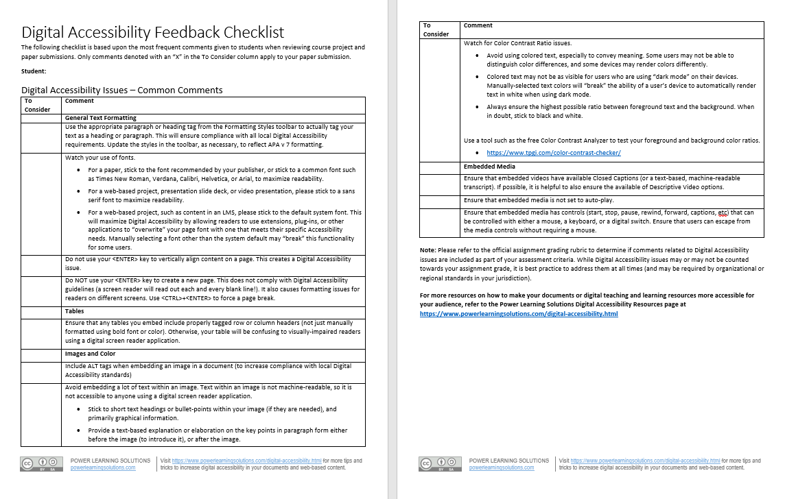
Adobe (2023b). Adobe Acrobat Reader. https://www.adobe.com/ca/acrobat/pdf-reader.html Adobe (2023c). Creating accessible PDFs. https://helpx.adobe.com/ca/acrobat/using/creating-accessible-pdfs.html Adobe (2023d). How to customize your toolbar. https://helpx.adobe.com/ca/acrobat/how-to/customize-toolbar.html Canadian Council for Occupational Health and Safety (n.d.). WHMIS.org: Canada's Workplace Safety Portal. https://whmis.org/ Microsoft (2022). Word. https://www.microsoft.com/en-us/microsoft-365/word Power, R. (2020, February 12). Two Basic Steps to Make Your Documents Digitally Accessible. [video]. https://youtu.be/AKzuXghQFnc Power, R. (2020, February 13). Helping Everyone Access Your Online Learning Resources. [Web log post]. Power Learning Solutions. https://www.powerlearningsolutions.com/blog/helping-everyone-access-your-online-learning-resources Power, R. (2023, February 2, a). Are Your PDFs Accessible? [video]. https://youtu.be/frOYI-y-XfE Power, R. (2023, February 2, b). Creating Accessible PDFs. [YouTube playlist]. https://youtube.com/playlist?list=PLIJ8QfsveW2Y5rFnTVytRkyVc46N3WXVI Power, R. (2023, February 3). Fixing PDF Accessibility. [video]. https://youtu.be/33h70ytABkc Power, R. (2023, February 2, c). Properly Exporting PDFs. [video]. https://youtu.be/F_QAGsHQ-FE TPGI (2023). Colour Contrast Analyzer (CCA). [Web page]. https://www.tpgi.com/color-contrast-checker/ Update (Feb 19, 2024): Updated versions of the Document Formatting Checklist and Digital Accessibility Checklist have been uploaded, included updated links for existing comments, and a new comment regarding the use of textboxes and Digital Accessibility compliance. I recently posted a video about how I use the mail merge features of Microsoft Excel and Word to automate my feedback to students about common APA paper formatting issues. I routinely include a checklist of common APA formatting issues when providing feedback on student paper submissions, checking off the items that each student seems to be struggling with. Over the past few terms, I have started embedding issues into my checklist related to Digital Accessibility concerns noted in students' papers and projects. Whether or not these issues are included in students' grades, it is important to highlight them to help promote awareness (and hopefully inspire a more Digital Accessibility-conscious practice mindset). I am constantly tweaking my checklist, and recent conversations with a colleague and with some of my students inspired me to do a broader-scale overhaul. In my latest version, I have separated out and expanded the Digital Accessibility comments. I also decided to post two versions of the updated checklist here for anyone who wants to integrate them into their feedback routine. One version is my full checklist, which include common APA version 7 formatting comments as well as Digital Accessibility issues. The second version, which might be useful for assignments and projects other than APA format student papers, includes just the Digital Accessibility issues. Both are available in Word and PDF format, and the Word versions are available with and without the embedded Excel mail merge fields (I have also included an Excel template with the merge fields). The APA Fomatting Checklist covers:
The Digital Accessibility Feedback Checklist covers:
I created the following video a while back. It provides a good overview of how to use the Excel file and merged Word document to automate the process of providing feedback with the templates for your students. Additional ResourcesCheck out the Power Learning Solutions Digital Accessibility Resources page for more tips and tricks to increase digital accessibility in your documents and web-based content.
I'm by no means an expert in all things digital accessibility -- but I am learning, because I think that it is vitally important that I do the things that are easy for me to do, which can have a huge impact for all of my potential learners and colleagues. To that end, this post looks at some of the things that I do already, and provides some useful tips and tricks to increase your compliance with basic digital accessibility standards. Making Documents More AccessibleOne of my graduate Education students recently asked for me for advice on how to make her dissertation document more digitally accessible, so I recorded a short video (2020, February 12) that highlights the two things that I find most commonly needed when writing papers, or creating instructional materials using a word processor like Microsoft Word:
I should point out -- as I do in the video -- that it is generally a bad idea to embed text within an image in a document (or on a web page). The text is not machine readable and, thus, will not be read by a digital screen reader application. That makes whatever text you have embedded within the image inaccessible to anyone who relies on a digital screen reader. It also creates difficulties reading the text on different screen sizes, as the text will not "reflow" or resize properly. Learning Technologies at College of DuPage (2018, July 3) has a good overview of additional tips for Creating Accessible Word Docs. They also have a wealth of additional resources on The Accessibility Cheat Sheet (2018, November 13) page. Making Web Content More Accessible I frequently create web-based content to either host learning resources, or to mediate the teaching and learning experience. Sometimes this content is hosted in a blog post (such as this one), on a public-facing web page, or on a content page within a learning management system (LMS). The three most common things that I find myself doing (and that I recommend to students when creating web-based content) are:
When it comes to properly "tagging" headings, I recommend sticking to the pre-formatting heading tags, which can be found on the toolbar at the top of the content editor. Just like with a Word document or PDF, anyone using a digital screen reader can easily navigate your page using their keyboard, or a digital switch, by "tabbing" through the pre-formatted headings. If you manually format your text, users won't be able to do this. (Sticking to the pre-formatted headings has an added advantage for you, because it allows site administrators to globally apply updates to organizational styles, including fonts, sizes, and colors, without you needing to update all of your previously created content!) eLearningBTC (2014) has an excellent video that demonstrates how to properly tag heading levels in the Canvas LMS. While the specific interfaces may look different for the various LMS platforms (such as Brightspace / D2L, Moodle, Blackboard, etc.), the concepts and principles are essentially the same in all of their content editor tools. Making Images AccessibleAgain, I advise against embedding a lot of text within images -- and that includes infographics. While infographics can do a great job of communicating concepts in a visually appealing way, they are just that -- visually appealing. The text they contain is not digitally accessible. If you are going to embed an infographic -- as with any images that you embed -- you should include ALT text that describes what the image portrays. You should also provide an alternate means of accessing the key points, such as listing or describing them in paragraph format either immediately before or after the embedded image. On the other hand -- sometimes you might embed an image that has no real content value. It is simply decorative (such as the accessibility icon at the top of this blog post). If users do not actually need to access the image to comprehend the content you are creating, many web authoring tools, and many LMSs, will allow you to check a box to "tag" the image as "decorative." If you do that, digital screen reader applications will skip the image altogether -- avoiding frustration for many users. I recently created a short video (2020, February 3) to show a group of my students how to add ALT text to their images when building a content page in the Canvas LMS. Color A simple rule of thumb for both documents and web-based content -- do NOT rely on color to tell the story (Comrade, 2015; Giessman, 2018). It seems counter-intuitive, but reliance on color to convey an important message can render your content inaccessible to a lot of users. In a similar vain, make sure that the colors you do use have a sufficient color contrast ratio. That means, it should be easy to distinguish your text against the color of the background. When in doubt, stick to reliable old black and white! You can use the The Paciello Group's (n.d.) free Color Contrast Analyzer tool to check your content for compliance with basic digital accessibility standards. Also, check out Interaction Design Foundation's (2018) Web Fonts are Critical to the Online User Experience - Don’t Hurt Your Reader’s Eyes. Adding Captions to VideosVideo is becoming an increasingly popular platform for sharing instructional content (or for student creation of assignment presentations). Video can be highly effective in this role. But, video is an audio-visual platform. Some users may not be able to hear your narration. Others may prefer to view the content with the volume turned off. For that reason, you should ensure that your videos contain closed captions. (Matheson, 2017) For my Two Basic Steps to Make Your Documents Digitally Accessible video, I taught myself how to use Screencast-O-Matic's (2019) new Captions feature to add closed captions. The following video (Screencast-O-Matic, 2018) shows how to do that yourself:  Now, you may not have access to video editing software such as Screencast-O-Matic. But chances are, if you are working with video content, you will be working with YouTube (Google, 2020) as a hosting platform. YouTube has built-in tools that allow you to automatically add closed captions, to upload your own captions, and to edit them online. VidIQ (2019) has an excellent quick overview of just how to do this: For more closed captioning resources, check out Described and Captioned Media Program's (2018) Caption It Yourself website. A Quick Workaround If you are not able to add closed captions when creating the video, one quick alternative is to prepare a document with the video's transcript, and post a link to a PDF of the transcript along with the video. It is not an ideal solution -- but for some, it is at least a basic means of providing a machine-readable way to access the content. Digital Accessibility Cheat SheetI was inspired to create this blog post when I was asked for some advice from one of my students, and then a colleague asked me if I had any good "cheat sheets" with basic Digital Accessibility tips for students or faculty. So... here is a Digital Accessibility Cheat Sheet that I put together summarizing some of the key points in this post. (Don't worry -- while this image-based version isn't really accessible, the downloadable PDF version is!) 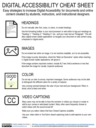
More Detailed Digital Accessibility Cheat SheetsMoritz Giessmann (2019) has posted an infographic-based cheat sheet for creating accessible web-based content (don't worry -- this infographic is HTML-based, not an image file, so it is accessible itself!). 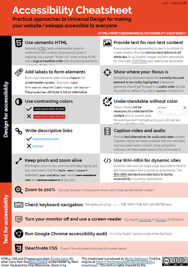 You can find a whole lot more detailed cheat sheets and resources from the following sites:
The following sites have even more resources, including full digital accessibility toolkits: ReferencesComrade (2015). AA Compliance Cheat Sheet. [Web page]. Available from https://comrade.github.io/accessibility/cheatsheet.html
Coolidge, A., Doner, S., & Robertson, T. (2015). BCampus Open Education Accessibility Toolkit. [eBook]. Victoria, BC, Canada: BCampus. Available from https://opentextbc.ca/accessibilitytoolkit/ Council of Ontario Universities (2017a). Accessible Digital Documents & Websites. [Web page]. Accessible Campus. Available from http://www.accessiblecampus.ca/reference-library/accessible-digital-documents-websites/ Council of Ontario Universities (2017b). Accessibility in E-Learning. [Web page]. Accessible Campus. Available from http://www.accessiblecampus.ca/tools-resources/educators-tool-kit/course-planning/accessibility-in-e-learning/ Digital A11Y (2020). WCAG Cheat Sheets & Checklists. [Web page]. Available from https://www.digitala11y.com/wcag-cheat-sheets/ Described and Captioned Media Program (2018). Caption It Yourself. [Web page]. Available from https://dcmp.org/learn/213 eLearningBTC (2014, June 26). Canvas Tip #18: Using Heading tags to improve Accessibility. [YouTube video]. Available from https://youtu.be/EN6M_Ksthms Giessmann, M. (2019, October 18). Accessibility Cheat Sheet. [Web page]. Available from https://moritzgiessmann.de/accessibility-cheatsheet/ Google (2020). YouTube. [Web page]. Available from https://www.youtube.com/ Interaction Design Foundation (2018). Web Fonts are Critical to the Online User Experience - Don’t Hurt Your Reader’s Eyes. [Web page]. Available from https://www.interaction-design.org/literature/article/web-fonts-are-critical-to-the-online-user-experience-don-t-hurt-your-reader-s-eyes Learning Technologies (2018, November 13). The Accessibility Cheat Sheet. [Web page]. Learning Technologies at College of DuPage. Available from https://www.codlearningtech.org/2018/11/13/the-accessibility-cheat-sheet/ Learning Technologies (2018, July 3). Accessibility Series: Creating Accessible Word Docs. [Web page]. Learning Technologies at College of DuPage. Available from https://www.codlearningtech.org/2018/07/03/accessibility-series-creating-accessible-word-docs/ Matheson, G. (2017). 5 Reasons You Should Caption Your Videos. [Web blog post]. Access Innovation Media. Available from https://blog.ai-media.tv/blog/5-reasons-you-should-caption-your-videos The Paciello Group (n.d.). Colour Contrast Analyzer (CCA). [Web page]. Available from https://developer.paciellogroup.com/resources/contrastanalyser/ Power, R. (2018, June 12). Accessibility in Online Teaching and Learning. [Web log post]. Power Learning Solutions. Available from https://www.powerlearningsolutions.com/blog/accessibility-in-online-teaching-and-learning Power, R. (2020, February 3). Adding ALT text in Canvas. [YouTube video]. Available from https://youtu.be/5wAR9OMWK78 Power, R. (2020, February 12). Two Basic Steps to Make Your Documents Digitally Accessible. [YouTube video]. Available from https://youtu.be/AKzuXghQFnc Screencast-O-Matic (2018, July 19). Adding Captions on your Screencast-O-Matic Videos. [YouTube video]. Available from https://youtu.be/vMW4qrrFc0g Screencast-O-Matic (2019). Video Creation for Everyone. [Web page]. Available from https://screencast-o-matic.com/ Slade, Tim (2017, February 26). 250+ Free Stock Photos for eLearning. [Web log post]. Timslade.com. Available from https://timslade.com/blog/stock-photos-for-elearning/ VidIQ (2019, February 1). How to Add Subtitles to YouTube Videos [New Method]. [YouTube video]. Available from https://youtu.be/qfJthDvcZ08  My first encounter with designing for Digital Accessibility was through a professional development program offered to my colleagues and me in the Advanced Learning Technologies Centre at College of the North Atlantic-Qatar by the Mada Assistive Technology Centre. I've been including discussions of digital accessibility in my graduate and undergraduate-level educational technology courses for several years now. I've also been "preaching" about the need to think about digital accessibility when designing eLearning courses and resources to my colleagues in various sectors. To further our ability to meet this need, in February 2017, I and my teammates in the Fraser Health Authority Online Learning Team participated in an online MOOC (Massive Open Online Course) through the University of Southampton called Digital Accessibility: Enabling Participation in the Information Society. Recently, I've received a number of requests for more information and resources -- both from my students, and my colleagues. I'm also working on a couple of new courses, where I'll be discussing this topic again. So, I figured that I would compile some of my favorites from several courses I've taught into a single blog post on the Power Learning Blog site. This post is by no means comprehensive, and I highly encourage you to search out the legislation, guidelines, and toolkits for your own province, state, or region... but these are solid resources that will help you understand the importance of addressing digital accessibility for online teaching and learning. I'll start with this excellent video by Berman (2014), who does a great job of showing us why we should care about Digital Accessibility: Web Accessibility Matters Traxler (2016). talks about accessibility and inclusion of all learners in the context of increased use of mobile technologies to mediate learning experiences.
Accessibility Toolkits for Online Teaching and LearningMany jurisdictions have already mandated technical and instructional design standards for user accessibility. The World Wide Web Consortium (W3C). provides an overview of accessibility issues and a list of standards that are increasingly drawn upon as the foundations of the accessibility policies, standards, and legislation being adopted by many organizations and jurisdictions. A common theme emerging from discussions of accessibility standards is that designing with accessibility in mind improves the learning experience for everyone – not just learners with specific accessibility issues.
Canadian Provincial Standards and Resources In Ontario, Accessibility in teaching and learning, including in online and blended learning contexts, is governed by the standards set out in the Accessibility for Ontarians with Disabilities Act. (AODA). The Council of Ontario Universities provides a number of excellent resources to help you make your online teaching and learning resources are accessible to all learners, and AODA compliant:  Other Canadian provinces are quickly catching up with the benchmarks set out by the AODA. In British Columbia, digital accessibility for online teaching and learning will be governed by the BC Accessibility 2024 .guidelines. BCampus recently published an Open Access eBook on how to make digital learning resources, such as eBooks, compliant with digital accessibility guidelines: More Resources
ReferencesAccessibility for Ontarians with Disabilities Act (2005, S.O. 2005, c. 11). Retrieved from https://www.ontario.ca/laws/statute/05a11
Berman, D. (2014, May 13). Web Accessibility Matters: Why Should We Care. [YouTube video]. Available from https://youtu.be/VIRx3RJzbZg College of the North Atlantic-Qatar (2018). [Web site]. Available from https://www.cna-qatar.com/ Coolidge, A., Doner, S., & Robertson, T. (2015). BCampus Open Education Accessibility Toolkit. [eBook]. Victoria, BC, Canada: BCampus. Available from https://opentextbc.ca/accessibilitytoolkit/ Council of Ontario Universities (2017a). Accessible Digital Documents & Websites. [Web page]. Accessible Campus. Available from http://www.accessiblecampus.ca/reference-library/accessible-digital-documents-websites/ (Links to an external site.) Council of Ontario Universities (2017b). Accessibility in E-Learning. [Web page]. Accessible Campus. Available from http://www.accessiblecampus.ca/tools-resources/educators-tool-kit/course-planning/accessibility-in-e-learning/ Described and Captioned Media Program (2018). Caption It Yourself. [Web page]. Available from https://dcmp.org/learn/213 Fraser Health (2018). [Website]. Available from https://www.fraserhealth.ca/ FutureLearn (n.d.). Digital Accessibility: Enabling Participation in the Information Society. [Massive Open Online Course]. Available from https://www.futurelearn.com/courses/digital-accessibility Interaction Design Foundation (2018). Web Fonts are Critical to the Online User Experience - Don’t Hurt Your Reader’s Eyes. [Web page]. Available from https://www.interaction-design.org/literature/article/web-fonts-are-critical-to-the-online-user-experience-don-t-hurt-your-reader-s-eyes The Paciello Group (n.d.). Colour Contrast Analyzer (CCA). [Web page]. Available from https://developer.paciellogroup.com/resources/contrastanalyser/ Mada (2017). Mada Assistive Technology Centre. [Web page]. Available from https://mada.org.qa/en/Pages/default.aspx Province of British Columbia (2014). Accessibility 2024: Making B.C. the most progressive province in Canada for people with disabilities by 2024. [PDF file]. Available from https://www2.gov.bc.ca/assets/gov/government/about-the-bc-government/accessible-bc/accessibility-2024/docs/accessibility2024_update_web.pdf Traxler, J. (2016). Inclusion in an age of mobility. Research In Learning Technology, 24. doi: http://dx.doi.org/10.3402/rlt.v24.31372 (Links to an external site.)Links to an external site. W3C (2016). Accessibility. [Web page] available from https://www.w3.org/standards/webdesign/accessibility |

AuthorRob Power, EdD, is an Assistant Professor of Education, an instructional developer, and educational technology, mLearning, and open, blended, and distributed learning specialist. Recent PostsCategories
All
Archives
June 2024
Older Posts from the xPat_Letters Blog
|
||||||||||||


 RSS Feed