POWER LEARNING SOLUTIONS
  • Home
  • About
    • About Rob Power >
      • Meet Rob Power
      • CV
      • Professional Dossier >
        • Cover Letter and CV
        • Portfolio Highlights
        • Research Background
        • Teaching and Instructional Design
        • Service Statement
      • Leadership and Project Management
      • Other Credentials
      • Artist Gallery
    • About Us
    • Consulting
    • In the News
    • Social Media >
      • LinkedIn
      • Twitter
      • YouTube
    • Contact Us
  • Publications
    • Academic Publications
    • Blog
    • Books >
      • AI for Seamless Education
      • The ALT Text
      • Blended Langauge Learning: Evidence-Based Trends and Applications
      • eLearning Essentials 2020
      • Everyday ID
      • Handbook of Mobile Teaching and Learning (2nd Edition)
      • IAmLearning
      • ID and Tech for Rapid Change
      • ID and Tech Vol 2
      • ID and Tech Vol 3
      • Inclusive Peer Learning & Augmented Reality in Higher Education
      • Mobile and ubiquitous learning: An international handbook
      • Operating System Fundamentals
      • Seamless Learning in Higher Education
      • Seamless Learning in Higher Educaton vol 2
      • Technology and the Curriculum: Summer 2018
      • Technology and the Curriculum: Summer 2019
      • Technology and the Curriculum: Summer 2022
      • Technology and the Curriculum: Summer 2023
      • Thriving Online: A Guide for Busy Educators
      • Fiction
    • Conference Presentations
    • Power Learning Daily News
  • Courses
    • Higher Education
    • K12
    • Open Courses
    • Professional Development
    • Digital Accessibility Webinar
  • Research
    • Alternate Pathways
    • Chat-T
    • CSAM
    • IRN-ISSE
    • mTSES
    • PETL
    • Online Learning During COVID-19
    • Student Co-Creation of OER
  • Resources
    • Augmented Reality
    • BOPPPS-IT 2.0
    • CNIE
    • Digital Accessibility
    • IAmLearn
    • IABL
    • ID Resources
    • Interactive RLOs
    • mLearn Conference Series
    • mLearn 2013
    • mLearning Vodcasts
    • Videos
    • YouTube
    • WebQuests
    • Portal

Should You Use Color for Emphasis?

2/13/2024

0 Comments

 
​It's more of an "i before e" than a "never do this" rule...
When should you use color for emphasis in instructional design?
​One of my instructional design students recently raised a good question about the use of color to emphasize text in digital documents (one that warrants a bit of a "mea culpa" on my part!). In the first weeks of the term, I advised students to avoid highlighting text or using colored fonts for emphasis. Then, in a recent response to another student's discussion forum questions, I highlighted her questions to set them apart from my responses. The recent question was along the lines of "you told us never to highlight text because it is a digital accessibility violation, but you just highlighted text in your post... can you clarify?"

Is it Ever Okay to Use Color for Emphasis?

So... my "mea culpa." ​My initial advice came across as a "hard and fast" rule -- NEVER use color for emphasis. The truth is, it is a bit more like the "i before e" rule of English spelling than an absolute. There are plenty of exceptions to the "i before e" rule in the English language. And, there are plenty of nuances to the "rules" around using color for emphasis of text in instructional design. In my early course advice, I didn't get into these nuances because we'll be exploring digital accessibility basics for instructional design in more detail later in the course (as students are building ID pilot projects). The original student had highlighted some key points in a discussion post for emphasis, and another student had configured all of their discussion posts to use a purple font. So, I brought up the topic of the use of color for emphasis a bit early, to get my students thinking about how to avoid creating unnecessary barriers for their reading audiences (kind of like how primary school teachers emphasize the "i before e" rule in the early grades, and let students learn the exceptions and nuances of English spelling later on). 
​The truth is, you CAN use colored text or highlighted text for emphasis. BUT, it ONLY works for "sight" readers who have no visual acuity issues. Such techniques will cause issues if:
  • "Sight" readers have visual acuity issues (such as full or partial color-blindness, or difficulty reading small text).
  • "Sight" readers have technology-related issues, such as screens that display text colors differently than the one you used when you created the resources, or that have monochromatic or grey scale displays.
  • "Sight" readers print out your text resources using a greyscale printer.
  • "Sight" readers attempt to use specialized software or browser plugins to change how text is displayed on their screens to accommodate for any number of accessibility issues, such as using an OpenDyslexic font plugin (OpenDyslexic, n.d.).
  • "Audio" readers use a screen reader application to have your text read out to them (in which case, the font colors or highlights used for emphasis will NOT be read out to them, so they will have absolutely no indication of the intended emphasis!).
​So... you CAN use color for emphasis. BUT, you must carefully consider the potential unintended consequences for your audience! The best strategy is to avoid using colored text or highlighted text unless absolutely necessary. That will avoid all of the issues noted above. Another strategy is to include some additional form of emphasis to grab the attention of "audio" readers, such as adding a graphical icon with appropriate ALT text like the following:
This is an important point!
It is important to use strategies that will indicate emphasis for anyone using a screen reader application.

In the example above, the "alert" icon creates additional emphasis for "sighted" readers. It also contains the ALT text "This is an important point!," which will be read aloud to "audio" readers who are using screen reader applications.
​Finally, you should always "test" your product before sharing it. You can use a color contrast analyzer tool like the free Colour Contrast Analyzer available from TPGI (2024). When testing color contrast ratios (the perceptive differences between the foreground (text) and background (page or screen) colors), be sure to also test the ratios when displaying the content in grey scale, and when displaying the content on a dark mode screen. Here's how that would look using a sample of the text like what I shared (using yellow highlighted text, and some text with a purple font) via our course discussion forum:
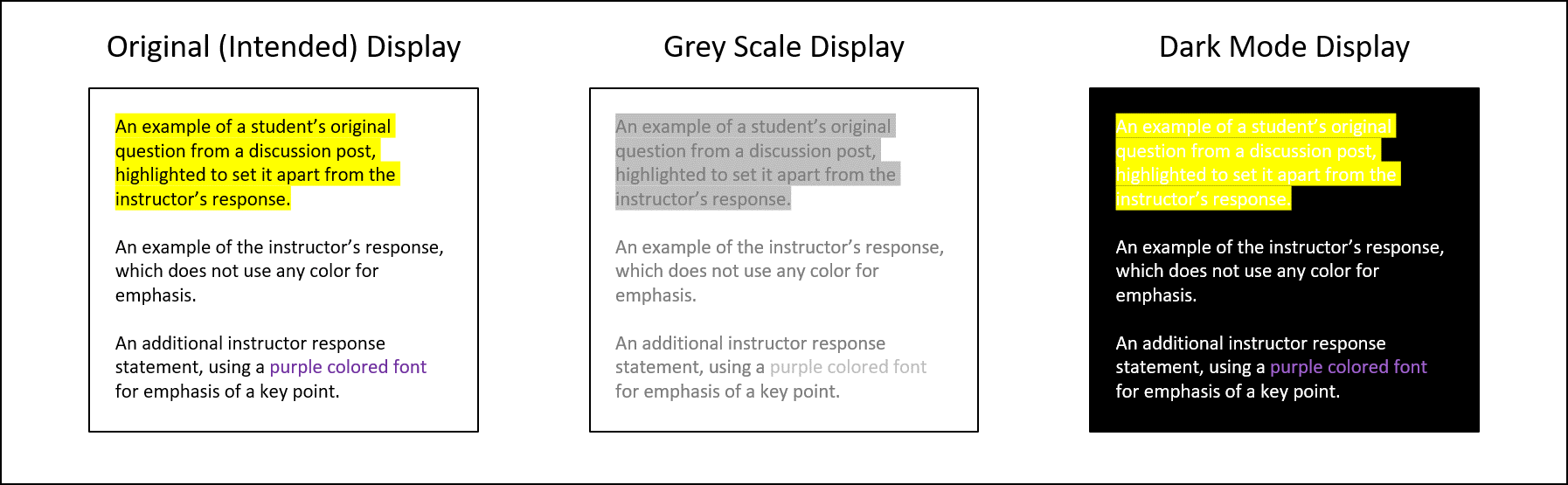
Examples of a discussion post with some yellow highlighted text and some purple text, displayed in light mode, grey scale, and dark mode.

Testing Color Contrast

Let's take a look at the results of color contrast tests on each text display version to see where we run into potential accessibility issues.
Default (Black on White) Text:
Black text on a white background produces the best color contrast ratio
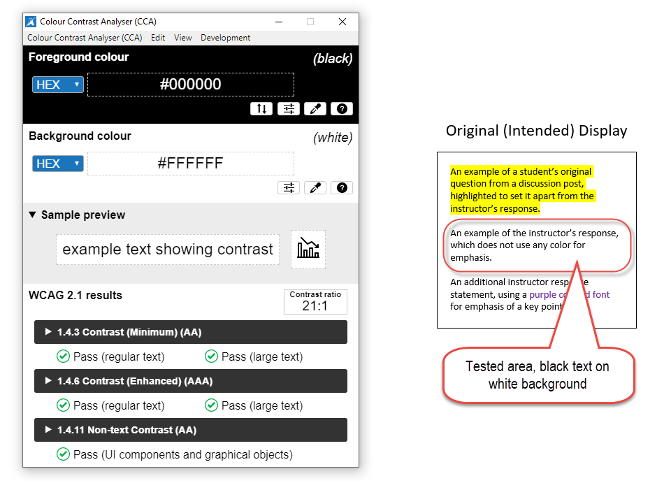
Black text on a white background produces the best color contrast ratio.
Testing the Highlighted Text:
The yellow highlighted text is still passable when viewed in
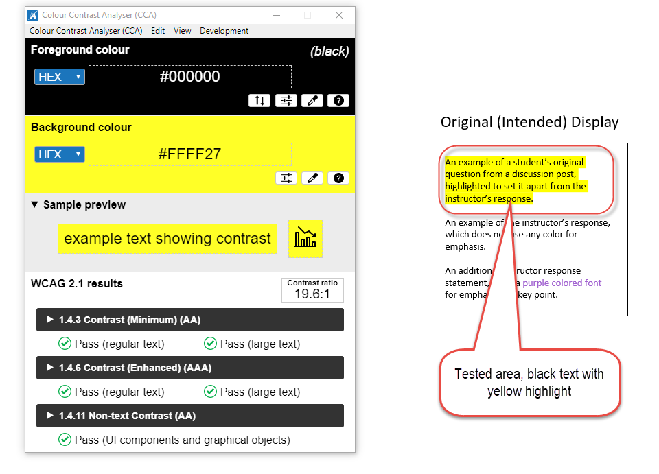
The yellow highlighted text is still passable when viewed in "light mode."
As you can see, the yellow highlighted text that I used in my discussion forum post is still readable, and passes all levels of WCAG standards for digital accessibility (World Wide Web Consortium, 2023). But, how about when that text is viewed in grey scale or on a "dark mode" screen?
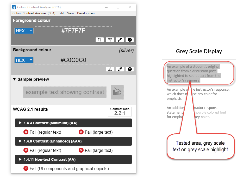
The highlighted text is barely readable in grey scale, and does not pass Digital Accessibility standards.
The yellow highlight completely
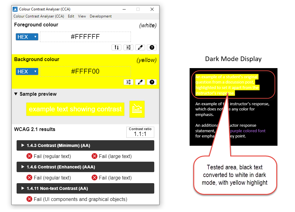
The yellow highlight completely "washes out" the default format text, which converts to white on a "dark mode" screen.
Testing the Purple Text:
Now, let's take a look at the text formatted with a purple font.
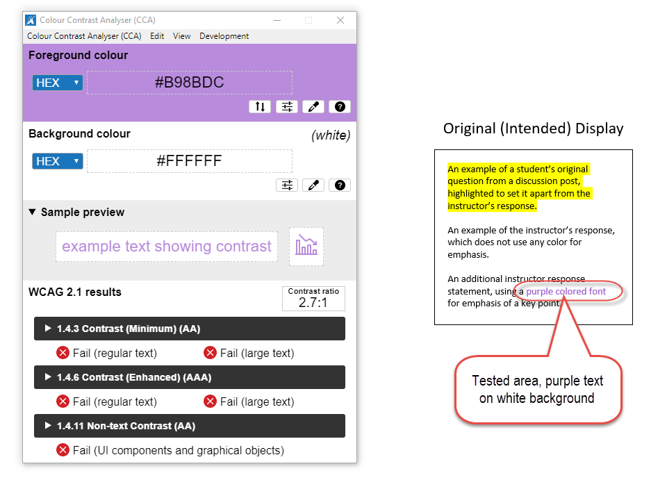
The purple font's contrast ratio is too low against the white background.
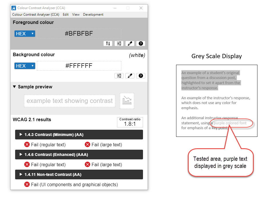
The purple text is barely readable when displayed in grey scale.
The purple font is okay for larger text when displayed in
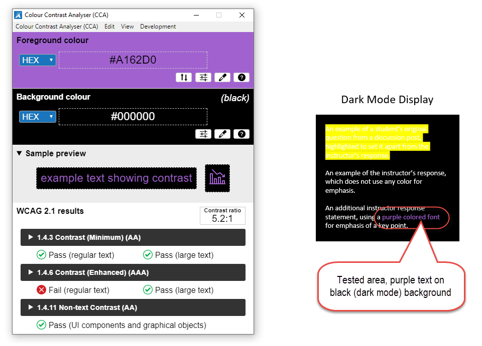
The purple font is okay for larger text when displayed in "dark mode," but may cause issues for smaller text.
The color contrast test results show that using a purple font can be problematic for your readers in just about any screen display mode.

Accommodating Everyone When Emphasizing Text

Digital Accessibility tips
Sometimes it is necessary to use color to emphasize things when creating digital teaching and learning resources (or any digital text resources). For instance, differentiating between items based on their color may be a functional technical requirement (such as with colored buttons), or one of your required content learning outcomes (such as differently colored safety labels). In those cases, you can use the following strategies:

  • Always test your color contrast ratios, especially in different display modes.
  • Always include some additional means of grabbing the attention of "audio" readers, such as an alert icon with appropriate ALT text.
  • In cases where you are telling readers to select or click on a colored button or icon, explicitly state something like "click on the red button to submit your assignment." Then, include appropriate ALT text for the desired icon or button such as "Red Submit Button" (rather than just "Submit Button").
The key is to ensure that any emphasis you intend to create by using color is not lost for any readers who cannot actually perceive that color, or who will have difficulty viewing the text because of the color choice!

Additional Resources

  • Digital Accessibility (the Power Learning Solutions digital accessibility resources page)
  • A Picture Isn't Always Worth a Thousand Words... (strategies for maximizing digital accessibility when working with images)
  • Helping Everyone Access Your Online Learning Resources (strategies for maximizing digital accessibility when creating text-based online learning resources, including documents and web pages)
  • Accessibility in Online Learning (chapter with a detailed look at digital accessibility from the Everyday Instructional Design eBook (Power, 2023)

References

OpenDyslexis (n.d.). OpenDyslexic: A typeface for Dyslexia. https://opendyslexic.org/

Power, R. (2020, February 13). Helping Everyone Access Your Online Teaching Resources. [Web log post]. Power Learning Solutions. https://www.powerlearningsolutions.com/blog/helping-everyone-access-your-online-learning-resources

Power, R. (2023, April 6). A Picture Isn't Always Worth a Thousand Words... [Web log post]. Power Learning Solutions. https://www.powerlearningsolutions.com/blog/a-picture-isnt-always-worth-a-thousand-words

Power, R. (2023). Chapter 17. Accessibility in Online Learning. Everyday Instructional Design: A Practical Resource for Educators and Instructional Designers. Power Learning Solutions. https://pressbooks.pub/everydayid/chapter/accessibility-in-online-learning/

TPGI (2024). Colour Contrast Analyzer (CCA). https://www.tpgi.com/color-contrast-checker/

World Wide Web Consortium (2023). Web Content Accessibility Guidelines (WCAG) 2.2. https://www.w3.org/TR/WCAG22/
0 Comments
    Power Learning Solutions: The Power to Access the World

    Author

    Rob Power, EdD, is an Assistant Professor of Education, an instructional developer, and educational technology, mLearning, and open, blended, and distributed learning specialist.
    More About Rob...

    Recent  Posts

    Categories

    All
    APA Formatting
    Augmented Reality
    Digital Accessibility
    EBooks
    EdTech
    Instructional Design
    Instructional Videos
    Learning Theoriies
    Mobile Learning
    Online Learning
    Open Access Resources

    Archives

    February 2025
    September 2024
    June 2024
    February 2024
    December 2023
    June 2023
    May 2023
    April 2023
    March 2023
    February 2023
    June 2022
    February 2022
    April 2021
    February 2021
    September 2020
    March 2020
    February 2020
    October 2019
    February 2019
    January 2019
    November 2018
    July 2018
    June 2018

    Older Posts from the xPat_Letters Blog

    RSS Feed

Proudly powered by Weebly
  • Home
  • About
    • About Rob Power >
      • Meet Rob Power
      • CV
      • Professional Dossier >
        • Cover Letter and CV
        • Portfolio Highlights
        • Research Background
        • Teaching and Instructional Design
        • Service Statement
      • Leadership and Project Management
      • Other Credentials
      • Artist Gallery
    • About Us
    • Consulting
    • In the News
    • Social Media >
      • LinkedIn
      • Twitter
      • YouTube
    • Contact Us
  • Publications
    • Academic Publications
    • Blog
    • Books >
      • AI for Seamless Education
      • The ALT Text
      • Blended Langauge Learning: Evidence-Based Trends and Applications
      • eLearning Essentials 2020
      • Everyday ID
      • Handbook of Mobile Teaching and Learning (2nd Edition)
      • IAmLearning
      • ID and Tech for Rapid Change
      • ID and Tech Vol 2
      • ID and Tech Vol 3
      • Inclusive Peer Learning & Augmented Reality in Higher Education
      • Mobile and ubiquitous learning: An international handbook
      • Operating System Fundamentals
      • Seamless Learning in Higher Education
      • Seamless Learning in Higher Educaton vol 2
      • Technology and the Curriculum: Summer 2018
      • Technology and the Curriculum: Summer 2019
      • Technology and the Curriculum: Summer 2022
      • Technology and the Curriculum: Summer 2023
      • Thriving Online: A Guide for Busy Educators
      • Fiction
    • Conference Presentations
    • Power Learning Daily News
  • Courses
    • Higher Education
    • K12
    • Open Courses
    • Professional Development
    • Digital Accessibility Webinar
  • Research
    • Alternate Pathways
    • Chat-T
    • CSAM
    • IRN-ISSE
    • mTSES
    • PETL
    • Online Learning During COVID-19
    • Student Co-Creation of OER
  • Resources
    • Augmented Reality
    • BOPPPS-IT 2.0
    • CNIE
    • Digital Accessibility
    • IAmLearn
    • IABL
    • ID Resources
    • Interactive RLOs
    • mLearn Conference Series
    • mLearn 2013
    • mLearning Vodcasts
    • Videos
    • YouTube
    • WebQuests
    • Portal